American Bird Conservancy
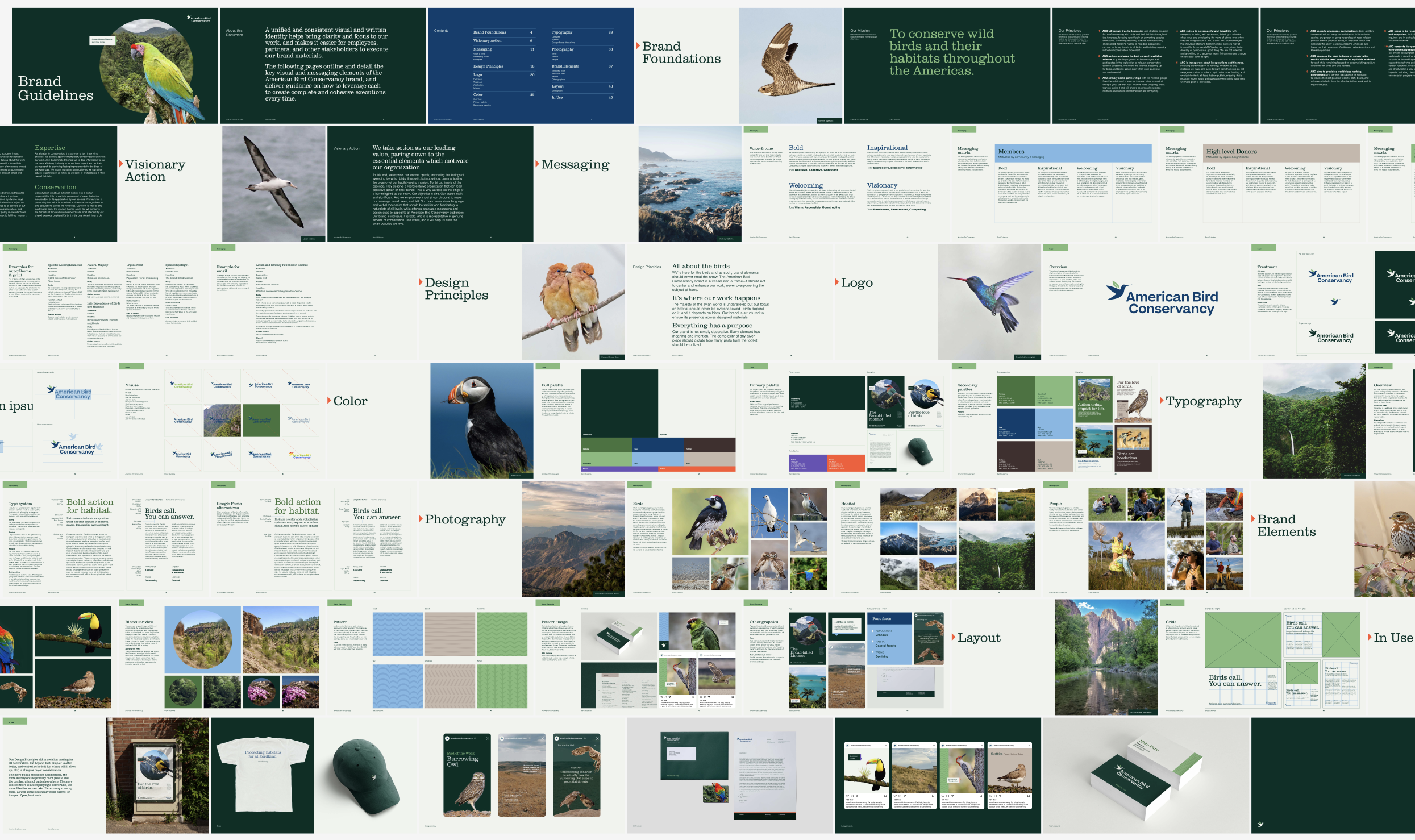
American Bird Conservancy partnered with Owen Jones to elevate its brand into one that matched the scale and urgency of its impact. Building from the organization’s existing mark, we developed a refined visual and written identity designed to communicate leadership, clarity, and action — broadening support while differentiating the organization within the conservation space.
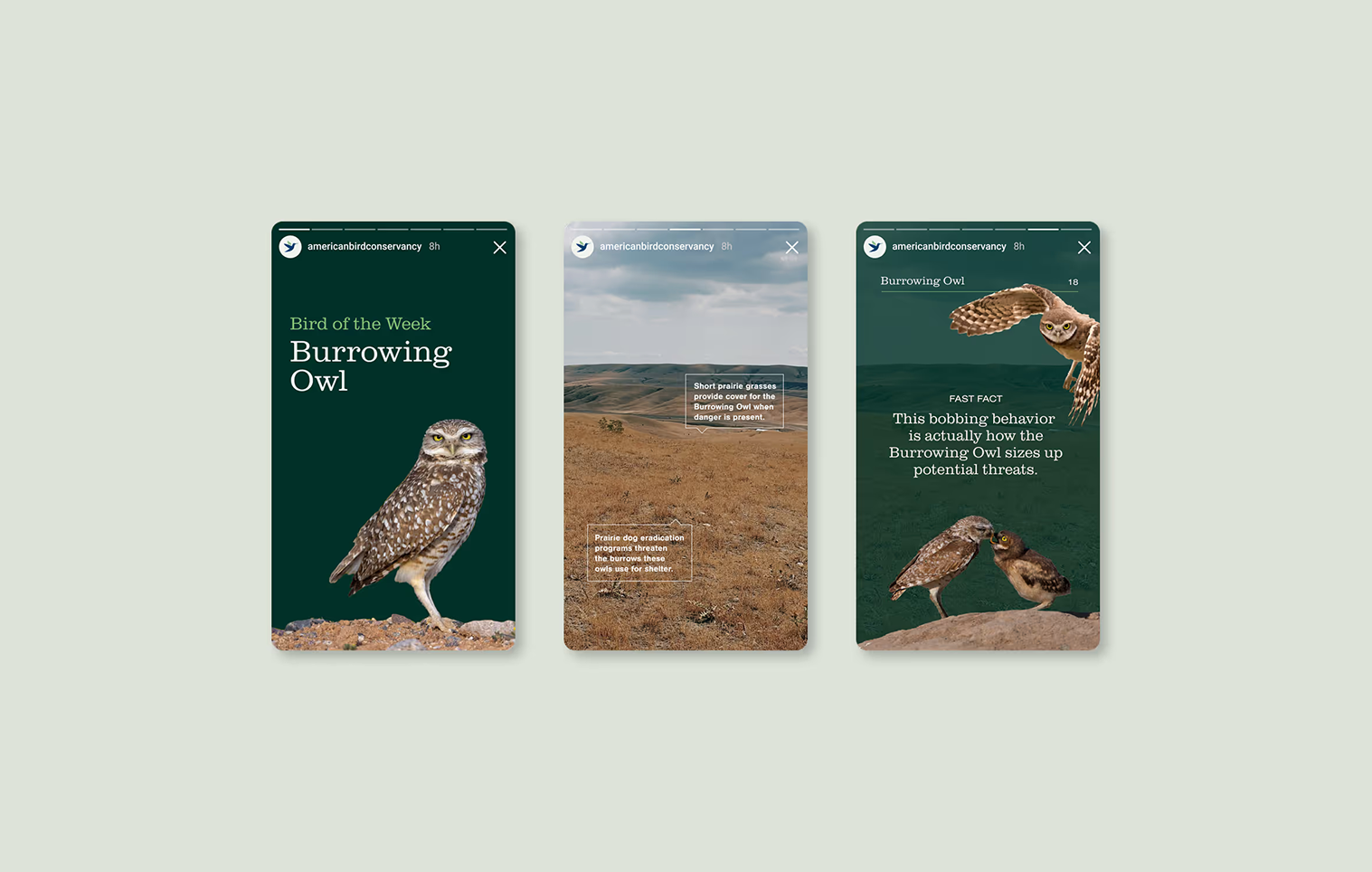
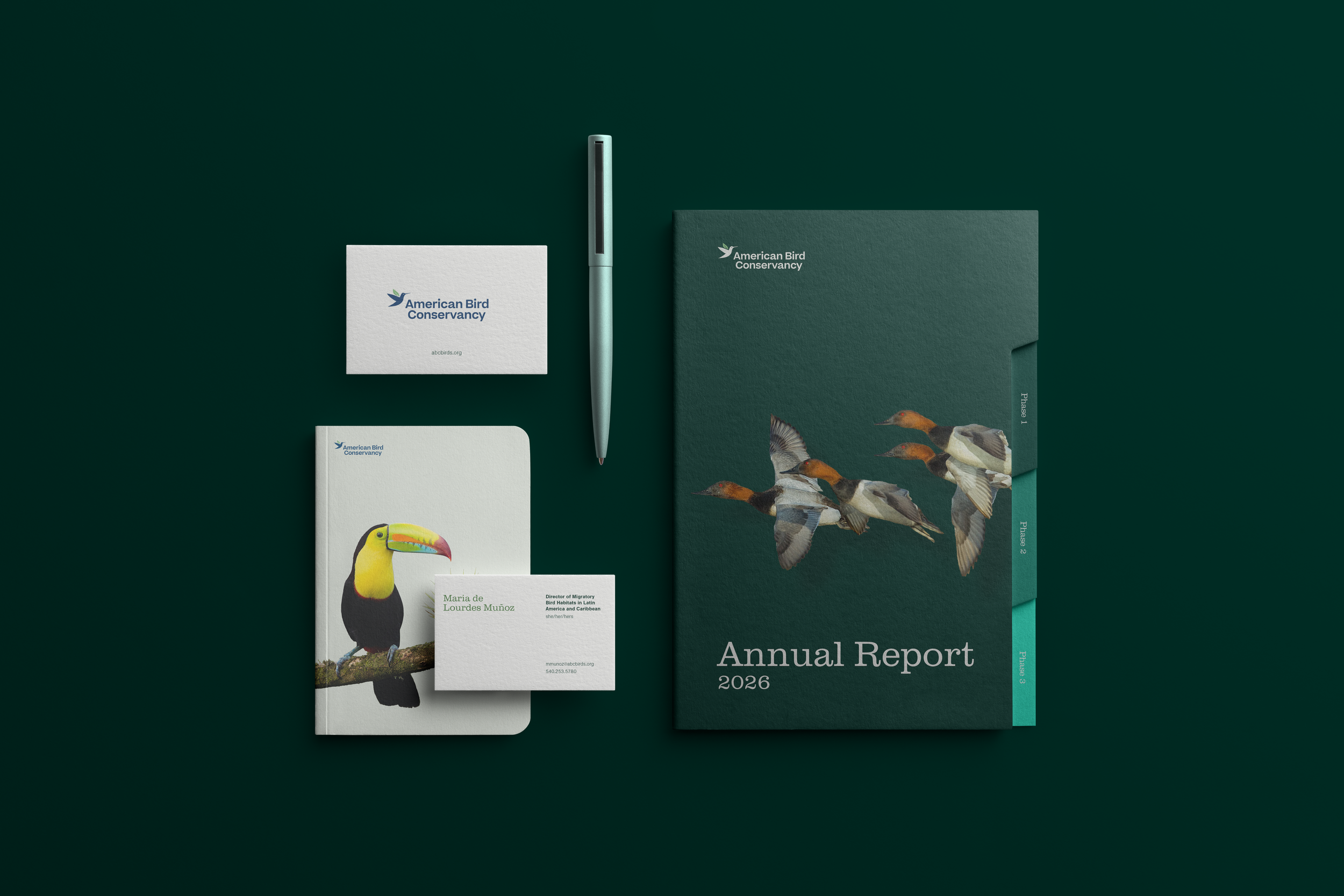
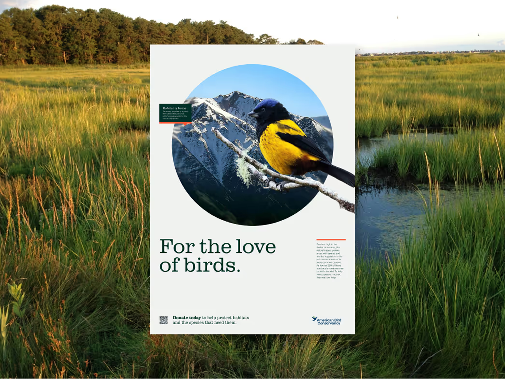
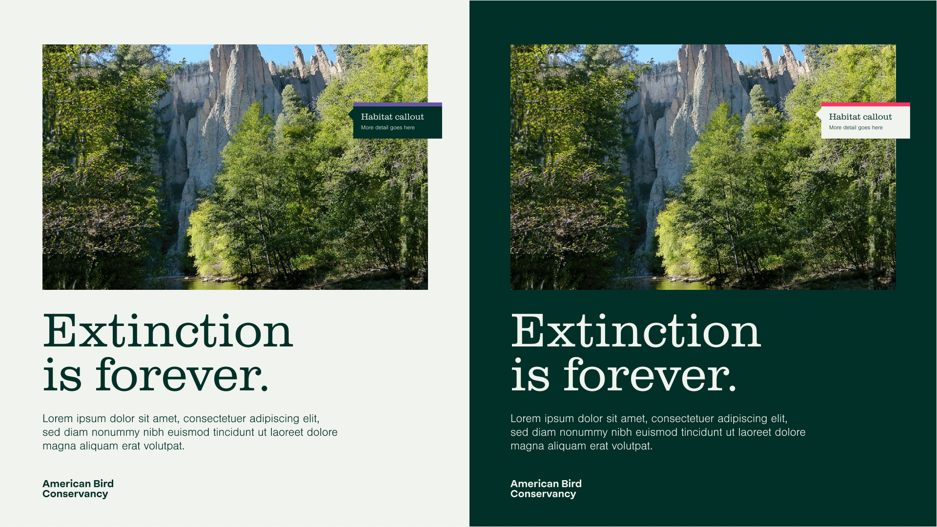
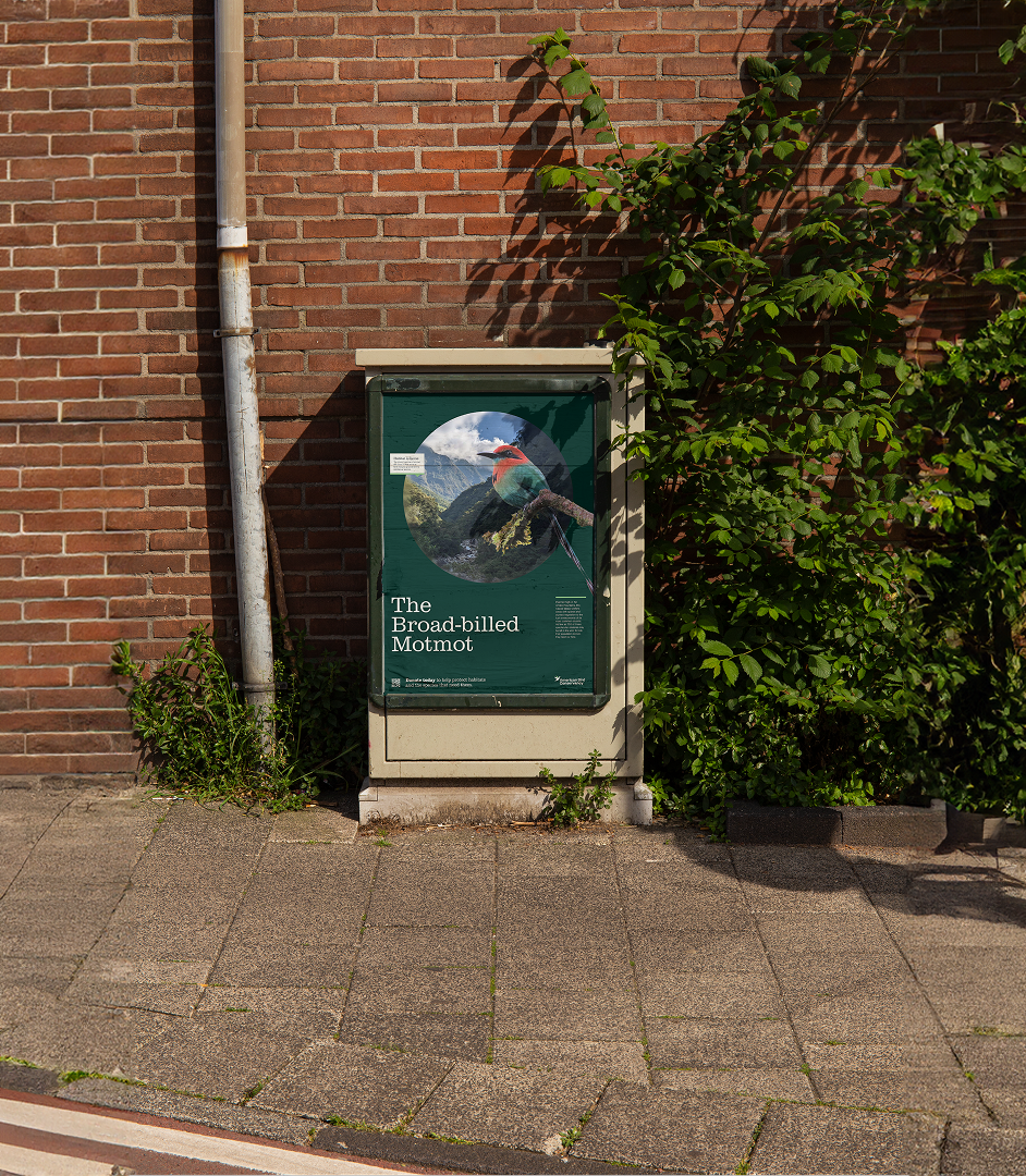
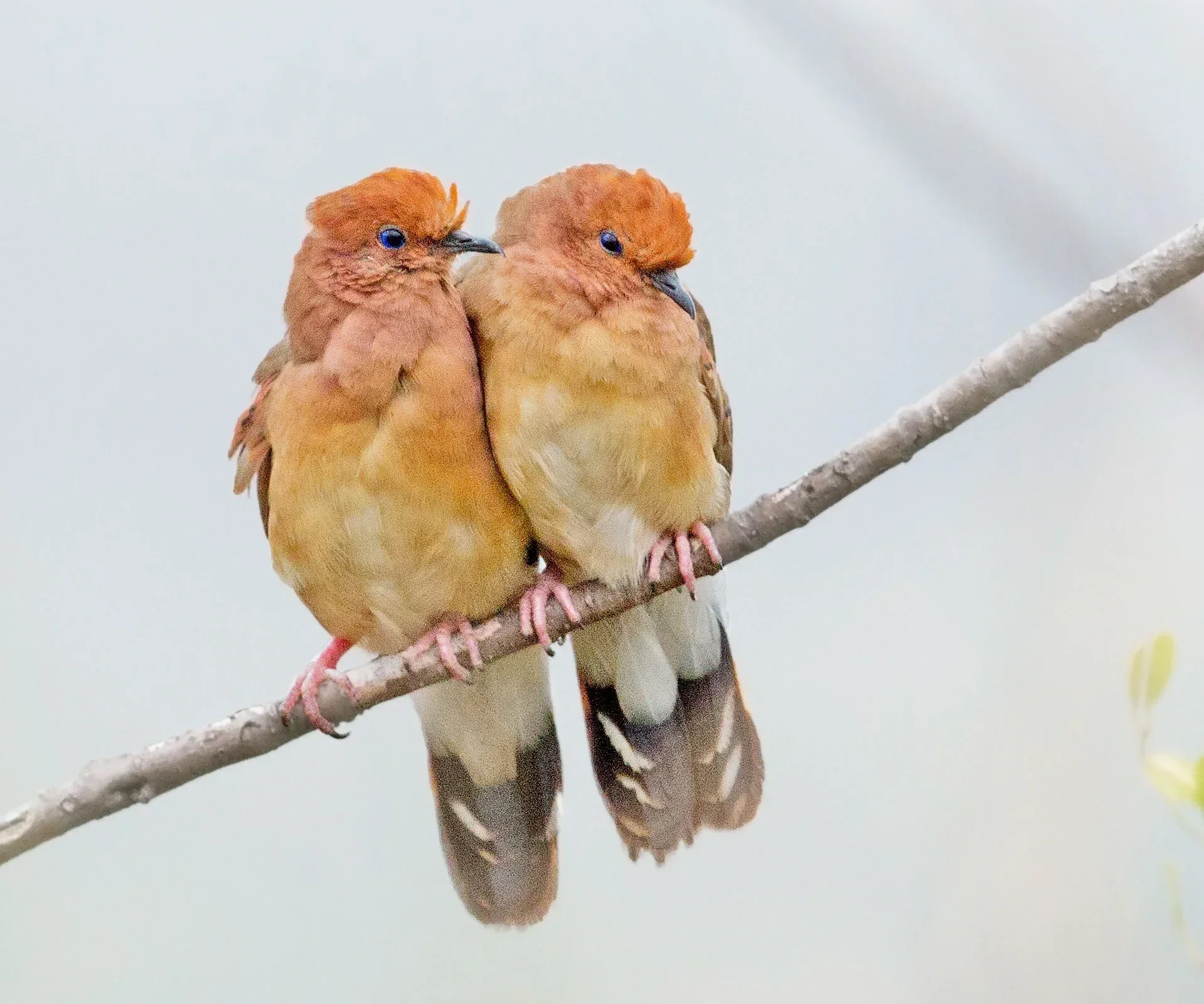
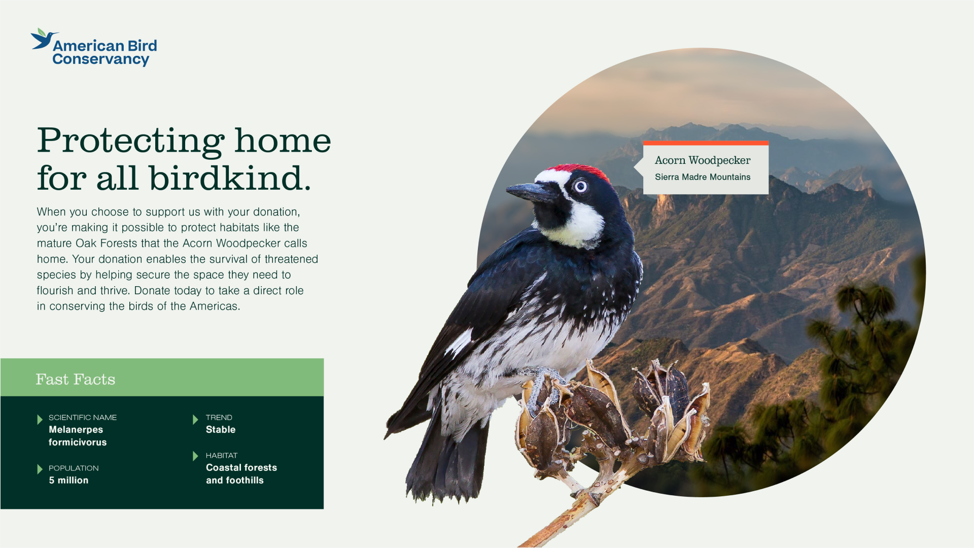
The resulting brand paired decisive messaging with a sophisticated flora-inspired palette, elevated typography, and striking photo collages that highlighted the beauty of birds and their habitats. Across every platform, the rebrand positioned American Bird Conservancy as a bold, modern voice for conservation.
Creative Director: Dylan Haigh
Associate Creative Director: Laura B Stull
Digital Creative Director: Josh Schield
Digital Art Director: Amanda Ruck
Brand Designer: Bryony Redhead
Digital Designer: Annie Lindsey
Copywriter: Harry Maguire